Revamped reporting: our most in-depth data yet
We’re always shouting about how OnHand helps employees do good and feel great. But OnHand isn’t just about creating brilliant impact for local communities and the planet – it’s also about tracking that impact.
We thought it was time to revamp our reporting, so our OnHand Admins can get super specific insights into the impact their people are creating. Let’s have a nosy at what’s new, shall we?
Watch the step-by-step tour now!
The Admin Page
This is where admins can get insight into all their employees’ good deeds. It’s split into 3 sections: the Actions tab, the Volunteers tab, and the Impact tab.
The Actions Tab
On the Actions tab, you can see which missions and pledges your people have done and when these actions were completed. But the data-tracking fun doesn’t stop there; you can zone in on exactly what you’re after with our new features.
You can now…
Sort these actions from oldest to newest or vice versa, or alphabetically by name or task type
Filter by task type, date range, team, or use multiple filters at once
Export your data as a CSV
The Volunteers tab
The volunteers tab is all about your people and their teams. You can add individuals to their teams and check out which teams are making the most impact.
The Impact Tab
This is the place to go if you fancy seeing the big picture. At a glance, you can see how many hours your people have volunteered, how many trees have been planted in your company forest, and how much CO2e your people have reduced. Plus, you can check out which organisations your company has helped the most.

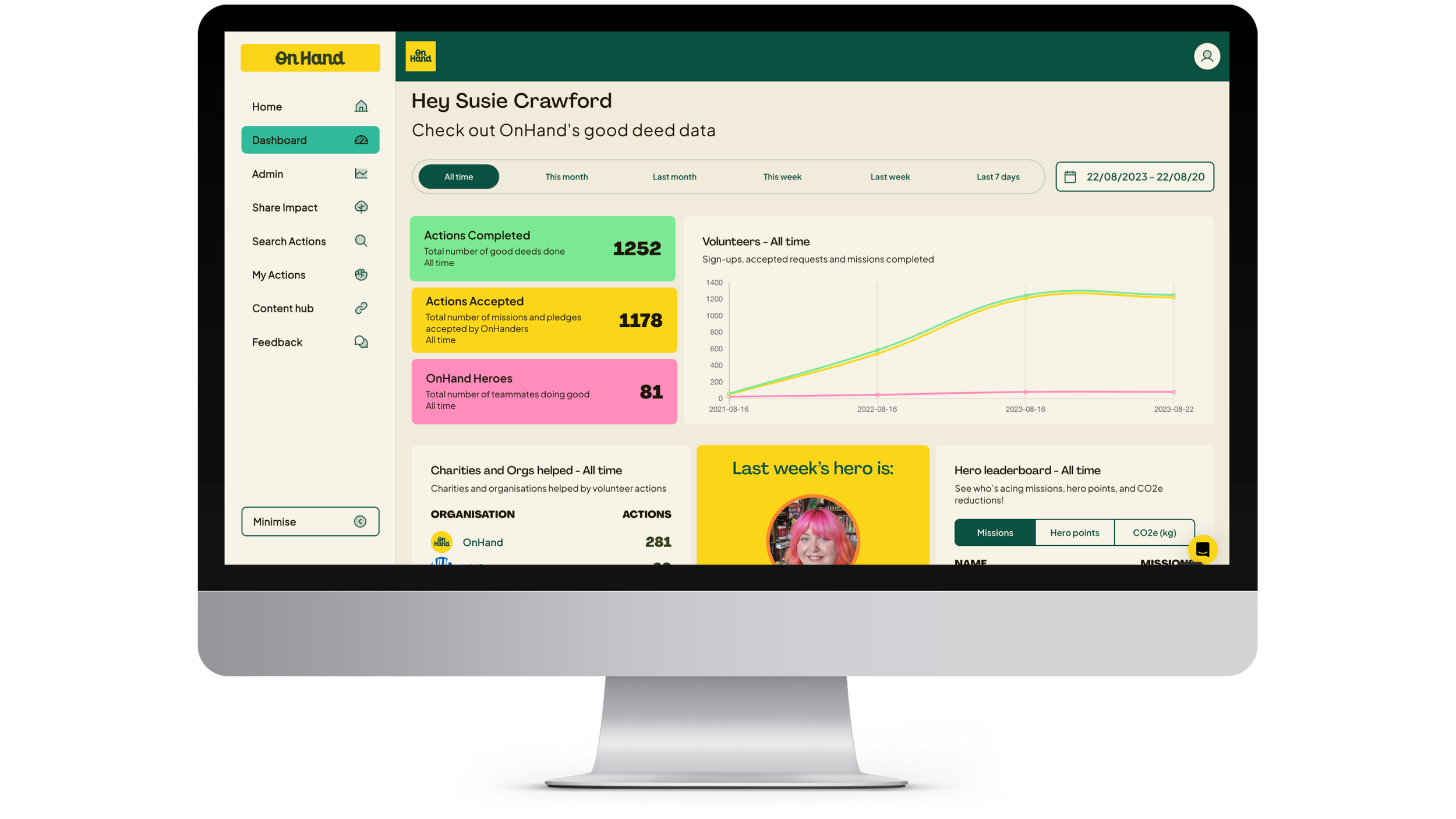
The Dashboard
The dashboard is where you can see how many of your people have signed up to become OnHanders, and how many actions they’ve accepted and completed.
When you scroll down, you’ll find a lovely list of the charities and organisations you've helped the most through your volunteer missions.
You can also see who last week's Hero was, and check out your Hero Leaderboard, which can be filtered by who’s completed the most missions, collected the most Hero Points, or reduced the most CO2e.
At the bottom of the page, you’ll also have access to some gorgeous graphs that show your company’s most popular task types. If you wanna dive into exact numbers, you can just hover your mouse over the graphs – colourful and clever.
And if you want to zoom in on a specific date range for any of the data on the Dashboard, that’s easy-peasy. You can just toggle the dates and you’ll see the relevant data. Pretty cool, right?
Fancy levelling up your ESG, CSR, or Social Value tracking?
Empower your people to do good, and then make sure you’re getting the detailed data you need to smash your ESG targets — book a demo today.